Create Tile Navigation for SharePoint Site
Introduction
In the realm of SharePoint Online, effective navigation is essential for enhancing user engagement and productivity.
The Smart Tiles is a powerful web part that enables tile-based navigation, allowing users to create visually appealing and intuitive layouts for their sites.
This article will delve into the features and benefits of Smart Tiles, providing insights on how to implement this tool to streamline access to important content and resources. Whether you're looking to improve team collaboration or create a more dynamic user experience, understanding Smart Tiles will help you unlock the full potential of SharePoint Online.
📝 Note
Smart Tiles does not support the classic page. Use it only with the new Modern UI.
Adding Smart Tiles
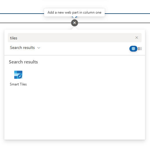
Open the page where you want to add a Tiles Navigation pane in edit mode. Hover your mouse over or under an existing section until a line with a plus sign appears. Click the plus sign to open the Web Part gallery. Browse through the available Web parts or use the search bar to find the "Smart Tiles" web part. When you find it, click on it to add it to your page.
💡 Tip
The Smart Tiles can be used to fill the full width of a screen. This feature allows you to make the best use of the available browser area on wide displays, enhancing the visual impact of your content.
Web Part Configration
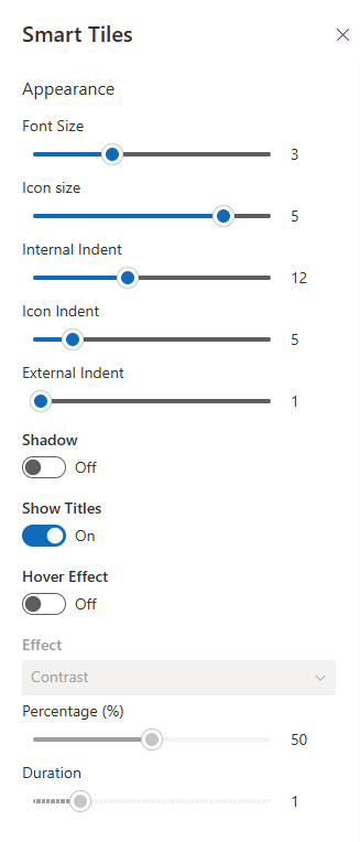
After adding the Smart Search web part, you can configure its settings by clicking the "Edit web part" button. This will open a configuration panel on the right side of your screen, where you can customize the settings.
Appearance Settings
The Smart Tiles web part provides a comprehensive set of options for customizing the appearance of the tiles. These settings allow you to tailor the look and feel of your navigation to align with your organization's branding and user preferences.
- Font Size: Adjust the size of the tile caption, which can range from 13px to 42px, ensuring readability across devices.
- Icon Size: Control the size of the tile icon, with a minimum value of 2em and a maximum of 5em, allowing for flexibility in design.
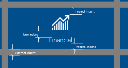
- Internal Indent: Set the tile padding in pixels to create a balanced look.
- Icon Ident: Specify the bottom margin for the icon in pixels to enhance visual separation.
- External Indent: Define the tile margin in pixels to control spacing between tiles.
- Shadow: Choose to show or hide a drop shadow under the icon for added depth.
- Show Titles: Decide whether to display or hide the tile titles for a cleaner look.
- Hover Effect: Implement effects that activate on mouse hover, adding interactivity to your tiles.
Tiles
To manage the tiles, please open the context menu for the tile you want to configure.
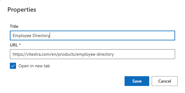
The properties of each tile are described in the following table:
| Property | Description |
|---|---|
| Caption | Title of the tile, always displayed in one line for clarity. |
| URL | Hyperlink associated with the tile, directing users to relevant content. |
| Color | Color of the tile, which can be set to the current theme accent color or one of the predefined colors. |
| Size | Vertical size of the tile. |
| Icon | Choose from four predefined sets of icons: Fluent UI Icons, Azure Apps, Microsoft 365 Apps, and Vitextra Apps |
| Open in new tab | Option to open the linked content in a new browser tab for user convenience. |
Additional Settings
In addition to the basic tile properties, you can select the color of the text and icon. The text can be set to either black or white, ensuring good contrast against the tile background. If neither color is selected, the text color will depend on the tile color, maintaining visual harmony.
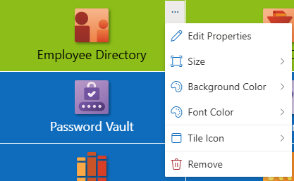
📝 Note
The icon color option is only available for Fluent UI icons, and other icons will ignore this setting.
Adding a Full-Width Section (Optional)
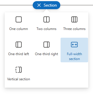
To use Smart Tiles effectively in a full-width section, ensure you have added a full-width column on the page. This layout maximizes the visual impact of your tiles and enhances user engagement.
To add a full-width section, click the + icon that appears on the left side of the page to add a new section. From the layout options, choose the Full-width section, which allows your content to span the entire width of the page, creating a seamless and immersive experience.
Adding the Web Part to the Section
To add the Smart Tiles web part to the full-width section, simply move it from a general section to the full-width one. This transition allows for a more engaging layout that takes full advantage of the screen space.
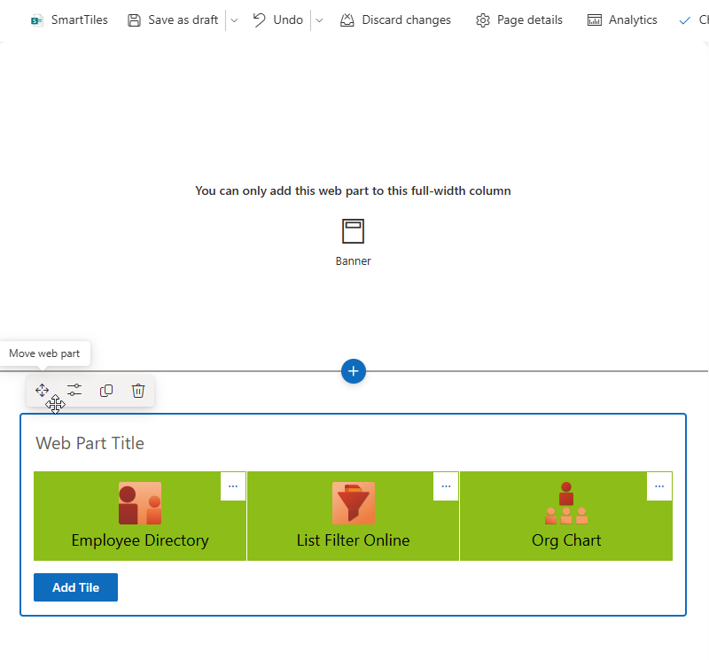
By following these steps and utilizing the features of Smart Tiles, you can create a visually appealing and user-friendly navigation experience in SharePoint Online.
Summary
In this article, we explored the Smart Tiles web part in SharePoint Online, highlighting its role in enhancing navigation through visually appealing, tile-based layouts. We discussed the steps to add Smart Tiles to your pages, including how to configure their appearance and manage individual tile properties. Additionally, we covered the benefits of using full-width sections to maximize visual impact and user engagement.
By effectively implementing Smart Tiles, organizations can create a more dynamic and user-friendly experience, ultimately improving access to important content and fostering better collaboration among team members.
Whether you're new to SharePoint or looking to optimize your existing setup, Smart Tiles offer a powerful solution for modern site navigation.