Introduction
An icon is what makes a tile recognizable before its title is read: the Outlook logo, a PDF symbol, a telephone. Smart Tiles ships with five icon sets that cover the common cases of an intranet — generic symbols, document types, Microsoft 365 applications, Azure services and Vitextra products — and accepts any image of your own where the sets fall short. This article describes the sets, the icon panel and the settings that control how icons are drawn.
The icon sets
| Set | Contents | Typical use |
|---|---|---|
| Standard icon | The Fluent UI icon font used throughout Microsoft 365: more than a thousand monochrome symbols — people, documents, calendars, settings, arrows and so on. | Generic destinations: Help Desk, Holidays, Policies. |
| File type icon | The colored file type icons of SharePoint: Word, Excel, PowerPoint, PDF, images, archives and other formats. | Links to a specific document or template. |
| App Icon | The product logos of Microsoft 365 applications: Outlook, Teams, OneDrive, Planner, Forms, Power BI and others. | Links that open an application or its web version. |
| Azure | The icons of Azure services. | Portals for IT teams and developers. |
| Vitextra | The icons of Vitextra products. | Links to pages built with other Vitextra web parts. |
Standard icons are drawn in the Font Color of the tile, so a white standard icon on a blue tile becomes a blue icon on a white tile with a single color change. The other four sets are full-color images and keep their own colors on any background.

Picking an icon
- Open the page in edit mode and click the … button of the tile.
- Point to Tile Icon and choose the set: Standard icon, File type icon, App Icon, Azure or Vitextra.
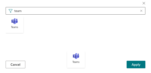
- In the Select icon panel that opens on the right, scroll through the icons or type part of a name into the search box — mail, calendar, xlsx.
- Click the icon and then Apply.
The icon currently used by the tile is highlighted when the panel opens, which makes it easy to pick a related icon from the same set.
📝 Note
A tile that links to a YouTube video shows a play button instead of its icon. The icon chosen for such a tile is kept and reappears if the link is changed to another address.
Custom images
The last item of the Tile Icon submenu, Custom image, replaces the icon with an image of your own — a company logo, a product picture or an icon drawn by your designers. The image is entered as a URL or picked from a document library of the site. Picking an icon from any of the five sets afterwards removes the custom image again. The procedure is described in KB10244. Using a Custom Image as a Tile Icon.
Icon settings of the web part
Four settings in the Appearance group of the property pane apply to the icons of all tiles:
| Setting | Effect |
|---|---|
| Icon size | Six steps: 20, 24, 32, 40, 48 and 64 px. The size applies to every set and to custom images alike. |
| Icon Indent | The space between the icon and the title, 0–30 px. |
| Shadow | A soft drop shadow under the icon. It gives flat standard icons depth and lifts full-color icons off a background image. |
| Show Titles | With titles hidden, the icon is centered in the tile and becomes its only content. |

💡 Tip
Keep to one set within a panel where possible. A row of monochrome standard icons in a single font color reads as one unit; a mix of standard, app and file type icons looks busier and draws the eye to the logos rather than to the titles.
❗ Important
Icons from the sets are shipped with the web part, so they need no additional permissions. Custom images are loaded from the address you provide; visitors must have read access to that location.
Learn more about the product: https://vitextra.com/en/products/smart-tiles