Discussions
Overview
The Discussions web parts have no colour or font settings of their own. Instead they take the theme of the page they are placed on - the site theme, the background of the section and the font of the site - and the Microsoft Teams theme when they run as a tab or a personal app. This makes a board look like the rest of the intranet without any configuration and keeps it readable when the site theme changes. This article describes exactly which parts of the theme are used and where, so you know what to expect when you change the look of a site.
How the theme reaches the web part
When a page renders, SharePoint Framework hands the web part the current theme - the site theme or, inside a page section with its own background, the theme variant of that section. The web part copies a fixed set of theme slots into CSS custom properties on its root element (--bodyText, --link, --primaryButtonBackground and so on), and its style sheet refers to those properties. Whenever the theme changes - a site owner picks another theme, a page author changes a section background, Teams switches to Dark - SharePoint re-renders the web part and the properties are written again.
Both web parts are built with Fluent UI, so the standard controls on the page (the view tabs, drop-downs, the search box, buttons, the command bar, message bars) are themed by Fluent UI itself; the custom properties cover the parts the product draws on its own - topic rows, badges, the reply tree, the editor.
Theme slots and where they are used
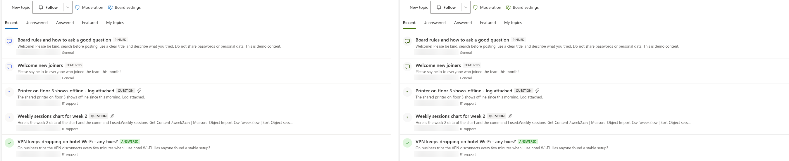
The web part copies the following slots of the theme. The table lists the ones visible in the interface; a few more are copied for Fluent UI controls (the accent and primary button states, card shadows, disabled borders, the button background and text, neutralSecondary).
| Theme slot | Used for |
|---|---|
bodyText | Topic titles, post text, the web part title, the text of the Not Configured screen |
bodySubtext | Metadata lines (author, time, category), excerpts, counters, placeholders, quotes |
bodyBackground | The editor area |
bodyStandoutBackground | The hover colour of topic rows, the type icon circle, neutral badges, the editor toolbar, code blocks, the highlighted item in the mention list |
bodyFrameDivider | The lines between topic rows, the border of the topic body, the left border of nested replies, the editor border, quote borders, the title input in edit mode |
link, linkHovered | Links in posts, the hover colour of topic titles, the focus border of the editor |
accent | The type icon of topics, the Like button after the current user has liked |
primaryButtonBackground, primaryButtonBackgroundHovered, primaryButtonText, primaryButtonBorder | New topic, Post, Create board and other primary buttons |
successBackground, successIcon, successText | The Answered and Accepted answer badges, the icon of answered questions, the background of the accepted answer |
infoBackground, infoIcon | The Question and Awaiting approval badges, the marker of pending items |
errorBackground, errorText | The badge showing the report count in the moderation queue |
The names are the slots of the Fluent UI theme, the same ones SharePoint derives from the primary colour of the site theme. A custom site theme created with the Theme Generator sets all of them, so any theme - not only the built-in ones - colours the board consistently.
Section backgrounds and full-width sections
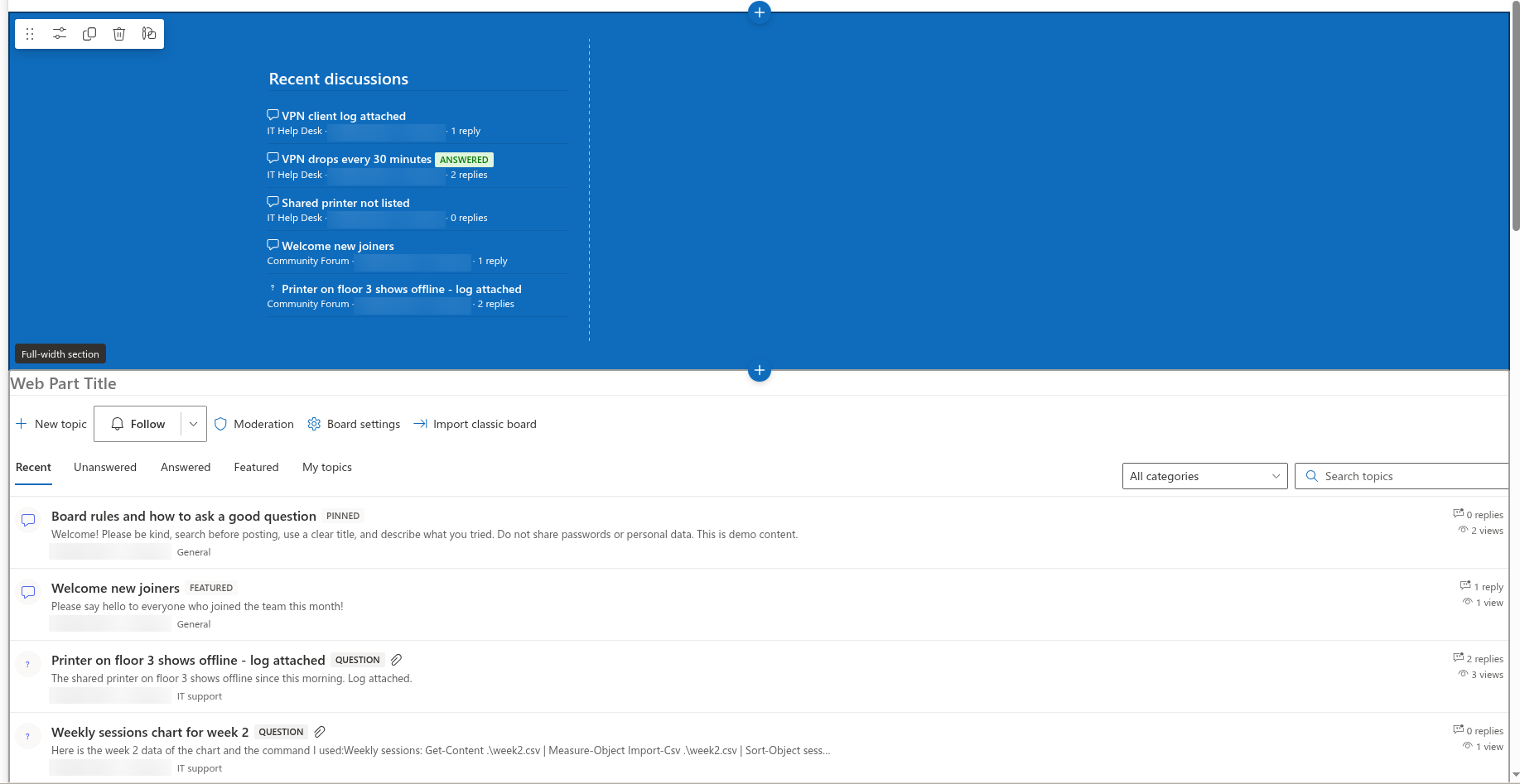
Both web parts declare support for theme variants. When a page author gives a section a background (Section background: Neutral, Soft, Strong), the web part receives the variant for that background and recolours itself - on a Strong background the text becomes light and the dividers follow suit. The Discussions web part additionally supports full-width sections of communication sites; the Discussions Activity web part is meant for narrow columns and does not.
The site font
If the site uses a custom font (Change the look → Font on a site, or a brand font set through the SharePoint brand center), SharePoint publishes it to the page as the CSS variable --fontFamilyCustomFont100. The web part reads that variable and applies the font to everything it draws - titles, rows, posts and the editor. Without a custom font the variable is empty and the web part inherits the font of the page, which is Segoe UI on SharePoint. Code blocks always use a monospace stack (Consolas, Courier New).
📝 Note
The Not Configured screen, shown while a board is being created or selected, uses the standard Segoe UI stack rather than the site font. Everything readers see after the board is configured follows the site font.
Microsoft Teams
As a channel tab or a personal app, the web part reads the theme of the Teams client instead of a SharePoint theme:
| Teams theme | What the web part uses |
|---|---|
| Default (light) | A fixed light palette matching Teams: dark text, blue links and buttons, light dividers |
| Dark | A fixed dark palette: white text, translucent white links and accents, dark grey backgrounds and dividers |
| High contrast | The light palette |
The switch is immediate: changing the Teams theme in the client settings re-renders the tab. In Teams the site theme of the underlying SharePoint site is not used, so a board looks the same in every team regardless of the site's theme. Adding the web part to Teams is described in KB10393. How to Add Discussions to Microsoft Teams.
Right-to-left languages
When the language of the site is a right-to-left language (Arabic, Hebrew), the web part sets the text direction of its root element to right-to-left: the toolbar, the counters, the reply tree and the editor mirror accordingly. The direction follows the site language, not the browser language.
Language of the interface and dates
The web part labels — views, buttons, badges and column names of created lists — support multiple languages, including English, Russian, Latvian, German, French, Japanese, Dutch and Spanish. The interface and relative times (such as 3 hours ago) follow the supported locale for the user’s SharePoint UI language, with English as the fallback for unsupported languages. The texts of topics and replies are, of course, whatever the authors wrote. Since version 26.10.3, hovering over the relative time on a topic and on each reply shows the full date and time in the long localized format, in the time zone of your browser - for example October 29, 2026 10:15 AM on English sites and 29 октября 2026 г., 10:15 on Russian sites. The relative times in the topic list, in the Discussions Activity web part and in the moderation queue have no such tooltip.
What cannot be changed
- There is no colour picker, theme override or custom CSS option in the property pane; the only way to change colours is to change the site theme or the section background.
- The icons of topic types (a speech bubble for discussions, a question mark for questions, a check mark for answered questions) and the badge texts are fixed.
- The layout - the toolbar, the row structure, the position of the counters - is fixed; the display settings in KB10422. Views, Paging, Search and Counters: Display Settings of the Discussions Web Part decide which elements are shown.
💡 Tip
If a board must stand out from the rest of the page, place it in its own section with a Soft or Neutral background and give the web part a title - the web part adopts the section's variant automatically, with no risk of unreadable text on a dark background.