Smart Tiles
Introduction
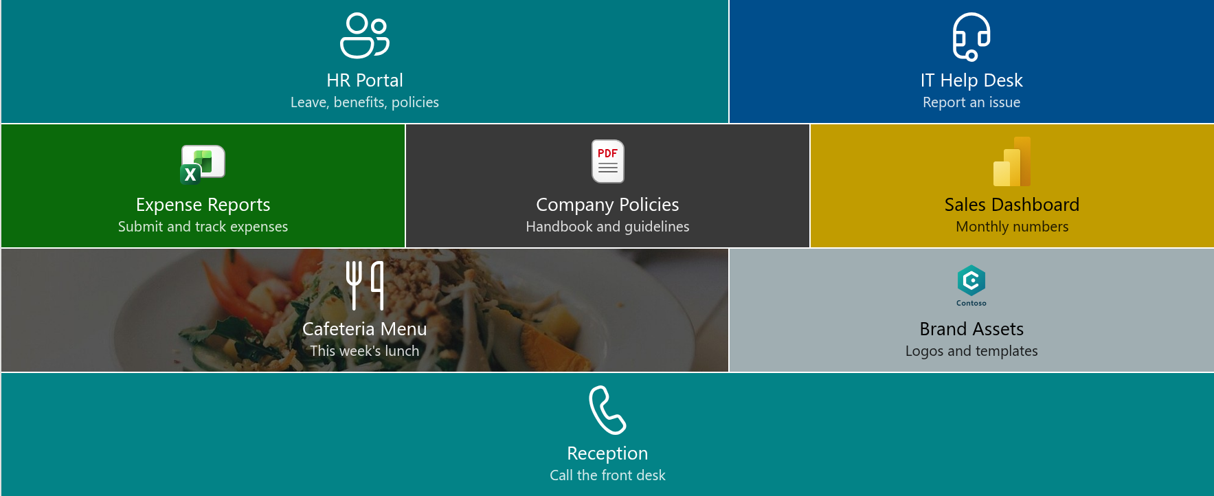
Every intranet page has a handful of destinations that people open far more often than anything else: the HR portal, the time-sheet system, the team's document library, the help desk. Smart Tiles turns those destinations into a panel of large, colored, icon-bearing tiles that visitors recognize at a glance and reach with a single click.
Smart Tiles is a SharePoint Framework web part for modern SharePoint Online pages. A page author adds it to a page, draws the tiles directly on the page in edit mode - no lists, no configuration files - and publishes. This article introduces the web part: where it works, what a tile can be, and which settings shape the panel as a whole.
Where Smart Tiles works
Smart Tiles is deployed to a Microsoft 365 tenant from the app catalog as a single package. After deployment the web part is available on every site of the tenant without further activation. It can be placed:
- on any modern page - a site page, a news post or a home page;
- in a regular section, in a section with columns, or in a full-width section, where the tiles stretch across the whole screen;
- on a single-part app page, where the tiles are the only content of the page.
The web part follows the theme of the site, including dark themes and the color variants of a section, and its interface is available in more than 40 languages, selected automatically from the language of the user.
📝 Note
Smart Tiles supports modern pages only. It cannot be added to classic pages.
What a tile can be
Each tile is a link with a look of its own. The properties of a tile fall into four groups.
Texts. A tile has a title and an optional description. The description is shown in smaller text under the title and in the tooltip of the tile; it can be switched off for the whole panel when a compact look is wanted.
Link. A tile can open a page, a document or any web address, in the same window or in a new tab. Beyond ordinary links, a tile can start an e-mail (mailto:), dial a number (tel:), send a text message (sms:) or open a Microsoft Teams chat or channel (msteams:). A link to a YouTube video is recognized automatically: the tile can show the video thumbnail as its background and gets a play button instead of an icon.
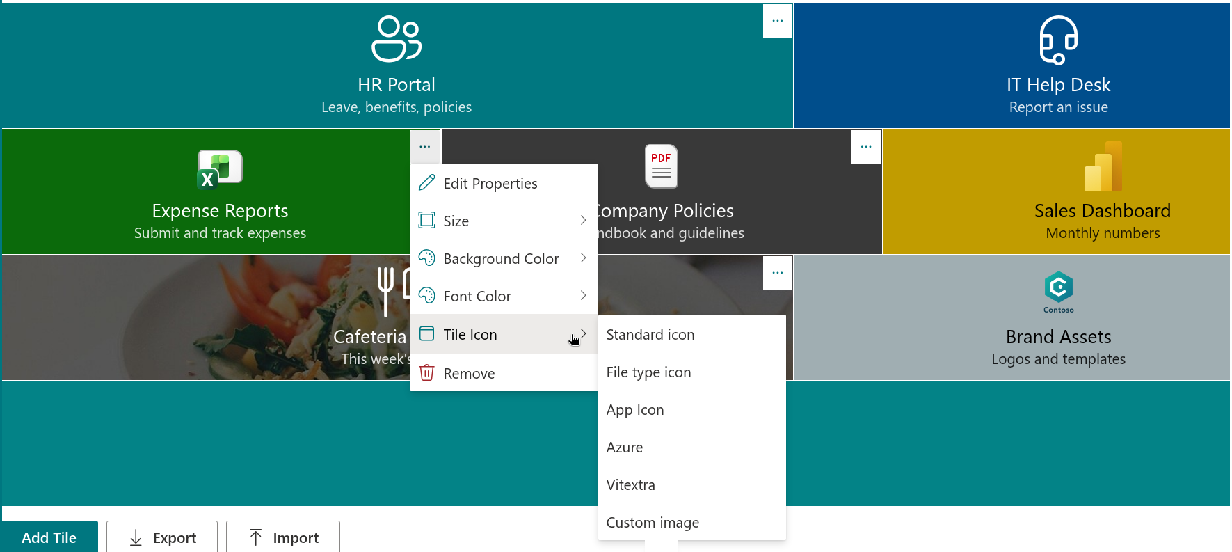
Look. Every tile has a background color and a font color, chosen from the six accent colors of the site theme, a palette of predefined colors, black and white. Instead of a color, a tile can carry a background image - entered as a URL or picked from a document library of the site. The icon comes from one of five icon sets - Standard (Fluent UI), File type, App (Microsoft 365), Azure and Vitextra - or is replaced by a custom image, such as a company logo. A tile comes in six sizes, from Extra Small to Full Width.
Audience. A tile can be shown only to members of selected SharePoint groups of the site or Microsoft Entra ID groups. Tiles without an audience are visible to everyone.
Settings that shape the whole panel
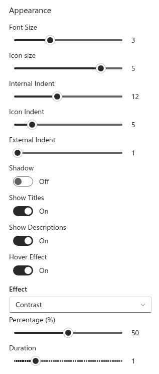
The property pane of the web part holds the settings that apply to every tile at once:
- Font Size and Icon size - seven and six steps respectively;
- Internal Indent, Icon Indent and External Indent - the space inside a tile, under the icon and between tiles;
- Shadow - a soft drop shadow under the icons;
- Show Titles and Show Descriptions - the texts on the tiles;
- Hover Effect - one of nine visual effects, such as brightness, blur or grayscale, applied when the pointer rests on a tile or the tile receives keyboard focus, with an adjustable strength and duration.
Editing on the page
All editing happens in the edit mode of the page, directly on the tiles:
- Add Tile adds a new tile at the end of the panel;
- the context menu of a tile opens its properties, changes its size, colors and icon, or removes it;
- tiles are reordered by dragging them;
- Export saves the tiles to a JSON file and Import loads them on another page or site, replacing the existing tiles or adding to them.
The web part stores the tiles in the properties of the page itself. No lists are created on the site, and nothing leaves the tenant: the tiles are published together with the page and follow its versions and approval flow.
💡 Tip
A navigation panel built once can be reused on every department site: export the tiles, open the Smart Tiles web part on the other site and import the file.
Visitors
A visitor sees a lightweight panel. The editing tools are loaded only in edit mode, so a published page downloads only what is needed to show the tiles. Tiles are announced as links by screen readers, can be reached and activated with the keyboard, and the hover effect respects the "reduce motion" setting of the operating system. Links that open in a new tab are isolated from the page that opened them.
❗ Important
Audience targeting hides a tile from users outside the selected groups; it does not restrict access to the linked content. Permissions on the destination page, library or application remain the only protection of that content.
Licensing
Smart Tiles is installed with a trial period. The About group of the property pane shows the status of the license, the version of the web part, the start date of the subscription and the tenant it is assigned to. When the trial ends, the web part shows a notice in place of the tiles until a subscription is activated.
💡 Tip
To deploy the web part in your tenant, see KB10035. How to Install a Vitextra Product in SharePoint Online. The first steps on a page are described in KB10042. How to Add and Configure the Smart Tiles Web Part.
Learn more about the product: https://vitextra.com/en/products/smart-tiles